|
|
Post by crazykeeper on Sept 3, 2007 19:13:28 GMT
|
|
|
|
Post by crazykeeper on Sept 3, 2007 19:20:05 GMT
Having put that up ive realised the white rangers jersey is missing so here you go ;D  |
|
Yotes
Forum Admin 
Posts: 16,423
|
Post by Yotes on Sept 4, 2007 12:54:16 GMT
Can't see why some teams are holding these back now. Surely it'd be better to release them and get the sales?
|
|
|
|
Post by crazykeeper on Sept 4, 2007 17:12:42 GMT
|
|
Yotes
Forum Admin
Posts: 16,423
|
Post by Yotes on Sept 4, 2007 17:25:45 GMT
I like both those Habs ones.
Just hoping the Yotes have steered clear of the lace up neck, can't be doing with that.
|
|
|
|
Post by maxfax on Sept 4, 2007 17:55:31 GMT
This has to be the worst looking jersey of the lot  |
|
Yotes
Forum Admin
Posts: 16,423
|
Post by Yotes on Sept 4, 2007 19:33:04 GMT
This has to be the worst looking journey of the lot Now I can see why they're holding that one back. Dreadful. |
|
|
|
Post by sawchuk on Sept 12, 2007 8:34:39 GMT
I think the Boston jerseys are the nicest out of the lot although the Capitals' jerseys are nice too. I don't expect big changes reference the Toronto jersey and it's highly doubtful I'll be getting on either. Having said that though, two pictures have turned up of the "new" Leafs jerseys and if they're accurate, I may buy one after all...   |
|
Yotes
Forum Admin
Posts: 16,423
|
Post by Yotes on Sept 12, 2007 16:27:16 GMT
Speaking of the Boston jersey, looks like someone's gone to work in Photoshop with the Bruins away for yours there Shin:  Even the laces look identical, which is a bit unlikely. (Slightly worried that I actually noticed that  ) Still, would make pretty good jerseys, especially the blue. EDIT: Having said all that, the Bruins home and away seem to be identical on the NHL shop (laces again), so Reebok probably just Photoshop all those images themselves from the same blank one. |
|
|
|
Post by sawchuk on Sept 12, 2007 23:26:28 GMT
The Boston "clone" would have been a great jersey but instead MLSE went with a dull an uninspiring effort from RBK. They could have been worse, but I wont be parting with any cash. 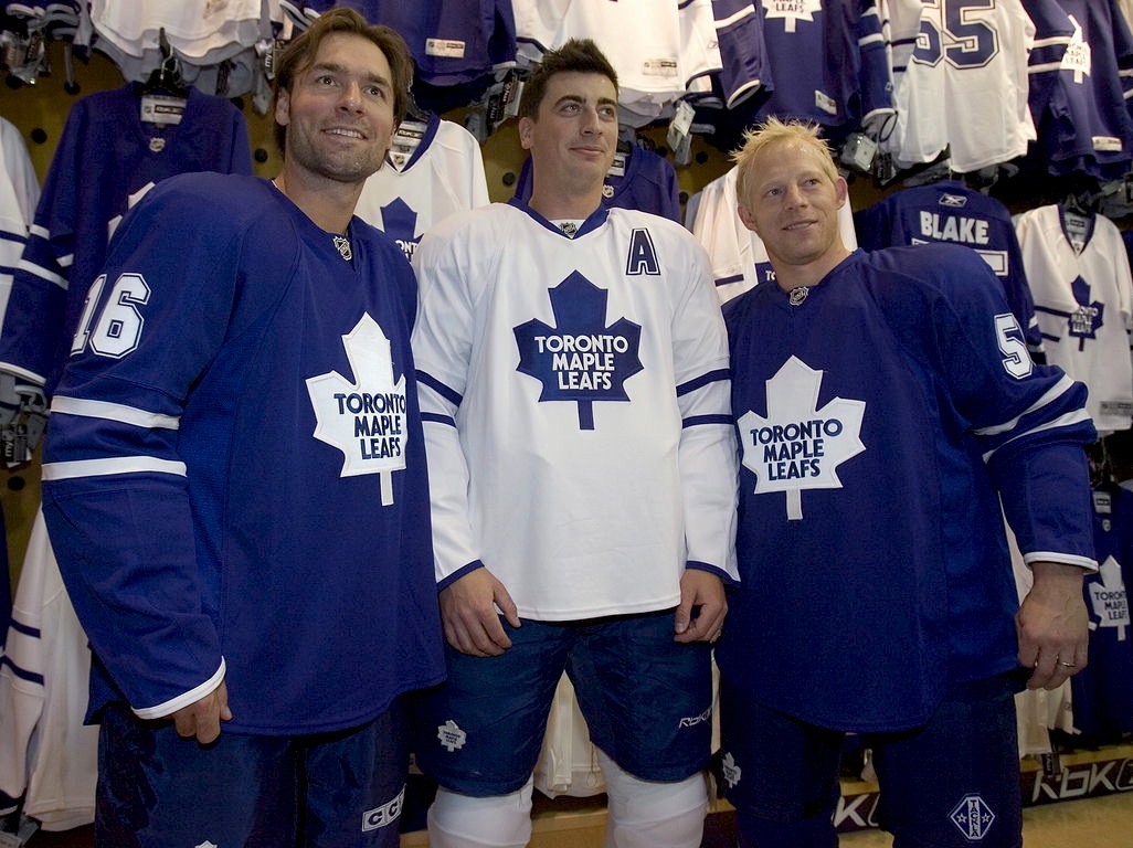 |
|
Yotes
Forum Admin
Posts: 16,423
|
Post by Yotes on Sept 13, 2007 17:11:49 GMT
Can't see the image there Shin, so:  Quite like the white. |
|
Yotes
Forum Admin
Posts: 16,423
|
Post by Yotes on Sept 16, 2007 11:58:29 GMT
Yotes release theirs:   Like the white, despite the lace up neck, might even get one. The home is a bit plain maybe, but not bad IMO. |
|
|
|
Post by Peacock on Sept 16, 2007 15:49:33 GMT
Those shirts'll make them look like the Toronto Maple Smurfs.
|
|
|
|
Post by sawchuk on Sept 16, 2007 17:01:51 GMT
Those shirts'll make them look like the Toronto Maple Smurfs. Because the Leafs haven't played in blue & white previously... |
|
|
|
Post by Peacock on Sept 17, 2007 0:04:57 GMT
They just seem so much 'bluer'
Serious question...have they changed the shade, cos it really does seem different.
|
|
|
|
Post by Peacock on Sept 17, 2007 0:10:04 GMT
Actually, looking at it again, it might be because there's no TML logo on the shoulder and no stripes around the bottom to break it up a bit. That and the white stripes on the sleeves seem a bit thinner.
|
|
|
|
Post by sawchuk on Sept 17, 2007 9:56:43 GMT
Actually, looking at it again, it might be because there's no TML logo on the shoulder and no stripes around the bottom to break it up a bit. That and the white stripes on the sleeves seem a bit thinner. Nah, the colours are the same but the jerseys are just too plain. I don't mind the TML patches being axed, but I reckon a single stripe on the hem of the jersey would have made it look a lot better. It's not the worst jersey on the market but I certainly wont be buying either. Rumour is the Leafs will alter the jersey for next season regardless.  |
|


 )
)
