|
|
Post by blackandgold73 on Aug 3, 2023 21:05:13 GMT
Devils rebranding ahead of the coming season...
|
|
|
|
Post by The Flying Shirt on Aug 3, 2023 21:28:17 GMT
The Gold Standard bar has just been lifted
|
|
Deleted
Deleted Member
Posts: 0
|
Post by Deleted on Aug 3, 2023 21:40:00 GMT
Did they launch a competition at the local junior school and that was voted the winner?
|
|
Yotes
Forum Admin 
Posts: 16,408
|
Post by Yotes on Aug 3, 2023 22:17:41 GMT
See what the jerseys look like, the current logo isn't exactly brilliant.
|
|
|
|
Post by bobness on Aug 4, 2023 7:52:39 GMT
See what the jerseys look like, the current logo isn't exactly brilliant. I like it, very on trend and contemporary. Not dis-similar to Giants in the mirror. As you say, the current logo isn't exactly a world beater. |
|
|
|
Post by pantherlee on Aug 4, 2023 9:01:03 GMT
The trend seems to be going back towards 2D profile images for logos now with Cardiff and Belfast
|
|
|
|
Post by Bagheera on Aug 4, 2023 9:08:25 GMT
See what the jerseys look like, the current logo isn't exactly brilliant. It's not until this new one was released you actually take a good look at the current/now old one. Looks like he's trying to push out a big one. Terrible. |
|
|
|
Post by Bagheera on Aug 4, 2023 11:29:29 GMT
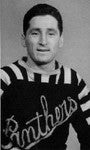
  It's so hard to unsee the penguin when somebody has pointed it out too. The little edited version made me chuckle this morning. The more I see the new logo I do think it's an upgrade on the last one. I wish Panthers would go back to something more like this. Always hated the current one. |
|
|
|
Post by kievthegreat on Aug 4, 2023 14:37:11 GMT
View AttachmentView AttachmentIt's so hard to unsee the penguin when somebody has pointed it out too. The little edited version made me chuckle this morning. The more I see the new logo I do think it's an upgrade on the last one. I wish Panthers would go back to something more like this. Always hated the current one. The new Devils just feels very generic or as one person on the website formerly known as twitter said, clipart! While I know we still joke about it because of Mel Gibson/Braveheart, the Clan for me nailed their new logo and branding. - It has the name of the team/city.
- It clearly identifies itself as a hockey team
- Even if you took out the words, you can see the visual representations of Scotland and Clan in the obvious Braveheart figure, but in details like the Celtic pattern surrounding the figure.
The devils could be any sports team from anywhere on the planet. Nothing tells me they are from Cardiff or Wales. Nothing suggests Ice Hockey. It doesn't convey anything except, "look, it's a picture of the devil". I get that their previous one wasn't any better in this regard, but if you're gonna change it, I'd expect an improvement. I don't think this offers any. |
|
|
|
Post by pantherlee on Aug 4, 2023 15:24:28 GMT
View AttachmentView AttachmentIt's so hard to unsee the penguin when somebody has pointed it out too. The little edited version made me chuckle this morning. The more I see the new logo I do think it's an upgrade on the last one. I wish Panthers would go back to something more like this. Always hated the current one. I really hope the Panthers don't go down this route. Like as been said its so generic and cliparty. Only my opinion but i quite like our current logo Do you reckon Devils and Giants used the same company as both their new logos as they're very similar in design? |
|
|
|
Post by Bagheera on Aug 4, 2023 21:30:29 GMT
View AttachmentView AttachmentIt's so hard to unsee the penguin when somebody has pointed it out too. The little edited version made me chuckle this morning. The more I see the new logo I do think it's an upgrade on the last one. I wish Panthers would go back to something more like this. Always hated the current one. I really hope the Panthers don't go down this route. Like as been said its so generic and cliparty. Only my opinion but i quite like our current logo Do you reckon Devils and Giants used the same company as both their new logos as they're very similar in design? They do look like the same person may have been involved in the design of both. Logos are all about personal taste of course. I don't really like the new Cardiff one but I do still think it's slightly better than the old. My very first reaction was still, urgh! As far as Panthers logo it doesn't need to be the exact same style. My favourite Panthers logo is going back some years to the side profile of the head though. So I'd still like to see us go back to something similar. |
|
|
|
Post by awooga on Aug 5, 2023 8:25:24 GMT
Came in to see Laughing Cow pic.
Leaves disappointed.
|
|